|
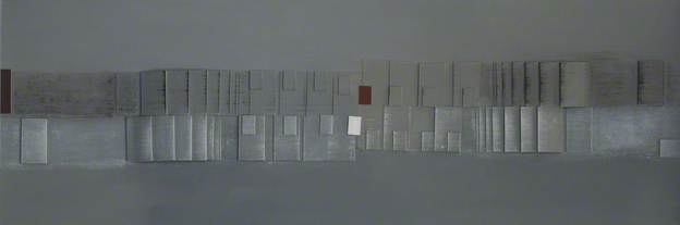
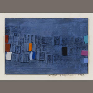
As third year draws to a close, I have time yet to continue with printing - screen printing to work on relationships between the fragments and the landscape from which they came. I am also planning to do one large painting to pull all the strands together. This is a 2m by 1.22 m board! I am taking inspiration from two works by Wilhelmina Barns-Graham in order to compose it. I will scan in original drawings I made a few years ago of the Viewforth site and use them as background - hopefully to be able to use yet another process as shared by colleague Mary Mackay. Basically it allows an image to be glued on to board. I have to ensure it is the right way round of course! I also will further explore the possibility of adding sections of screen print too. The horizontal rectangular shapes will be useful to add details of the beach pottery. I have done exploratory drawings to be added to this
0 Comments
The initial interest in creating art from beach pottery has held sway over the year and is no doubt set to continue into my final year.
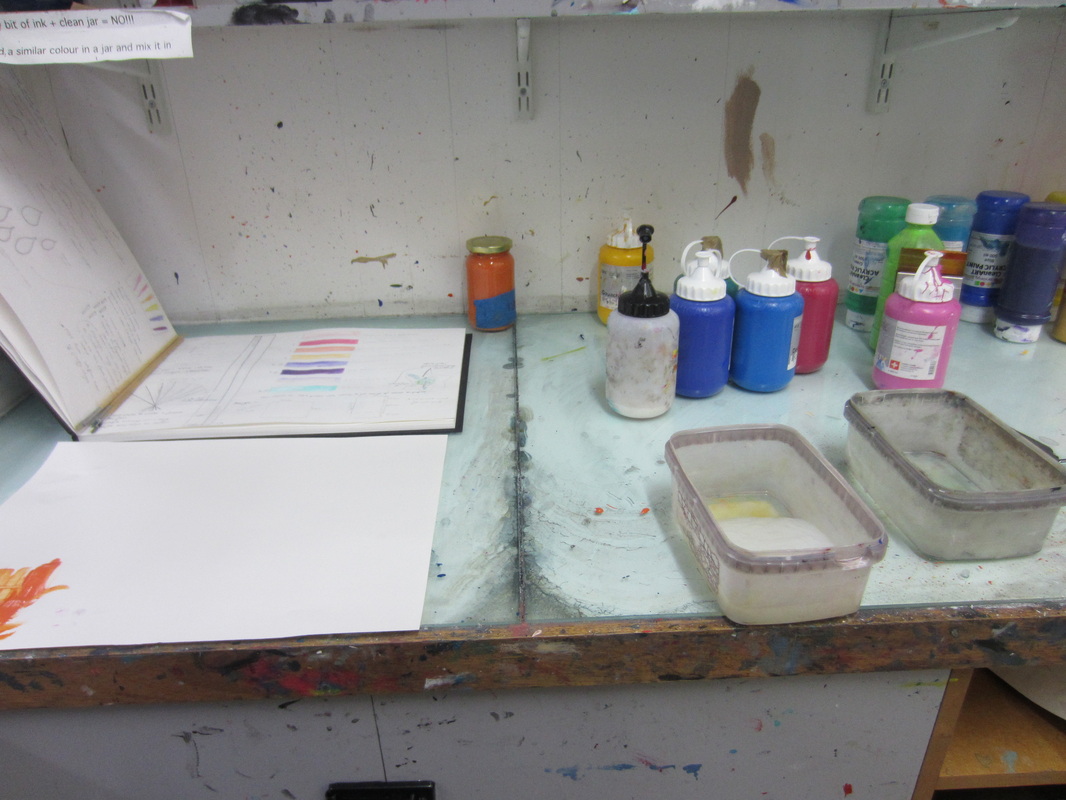
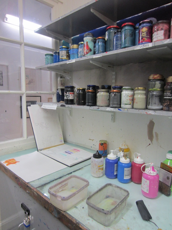
Initally I set out to explore the objects through experimentation with materials and settings. Then I began to be more intersested in what the objects could say for themselves. On a micro level, selected objects were painted to suggest the landscape itself. This was done on board 30 cm squared. Companion paintings were completed on a macro level to balance the detailed landscape ones and to suggest gentle overviews of the same landscape with the fragments merely implied. From there it seemed a natural transition to paint on found wood itself. Applying mixtures of sand, pva and acrylic paint where it felt appropriate, painting a replica of a small object too, sanding down and applying a mixture of beeswax/turps to restore and bring out the grain and finally adding geometric shapes from new wood to allow contrast. I wanted to explore how clay would work. Taking a pottery fragment and reinstating it into clay to produce a morphic shape that returned it in some ways to its origin. This was problematic as in the drying process, the clay pulled away from the fragment. This did allow for some cracking in the process which added to the appeal but the end products did seem fragile. By applying yacht varnish, adhesion was ensured to some degree. The final installation was to read as as cabinet of curiosity. Black paper was stuck to a wall to give set boundary lines and to add depth.I chose as a site, a section of panel in the Sculpture Court that was protecting one of the artefacts ECA is famous for. It read as a cLines for shelves were suggested on the horizontal plane and objects/paintings attached as if floating. Relationships were explored along the way. The micro paintings were put up first to set the scene - sky, boundary, land and sea. The others were arranged accordingly. From a distance it read as a form of map. Close-up the details and textures of the pieces could be explored. Black was perhaps not the best choice. A few criticisms were voiced. Ideally, I would have painted the background to provide a clean, polished background - probably best in dark grey, but time did not allow for this. We visited SGMA Two on Monday 19th November. Rachel Smith, the Assistant Curator showed us around. There were 100 + paintings plus works on paper on show. There was also a video which can be accessed on-line. In the Keiller Library, memorabilia was on display. The remit was to respond to the exhibition in book form. A panel of museum staff and ECA staff were to select from the entries in order to put on a display within the Library. There were strict criteria as regards size to follow.
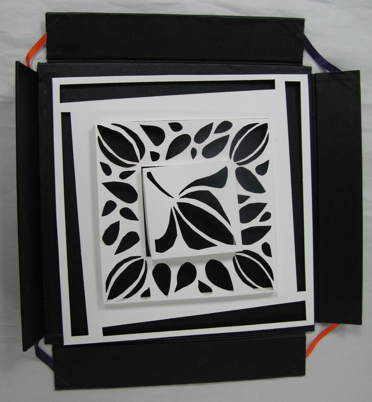
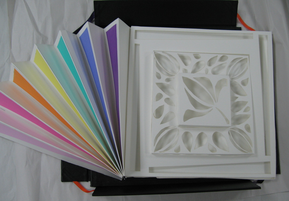
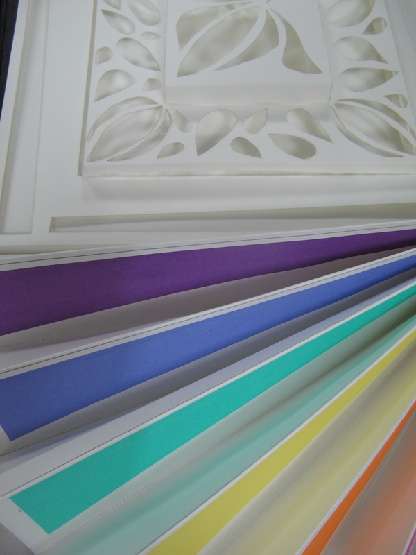
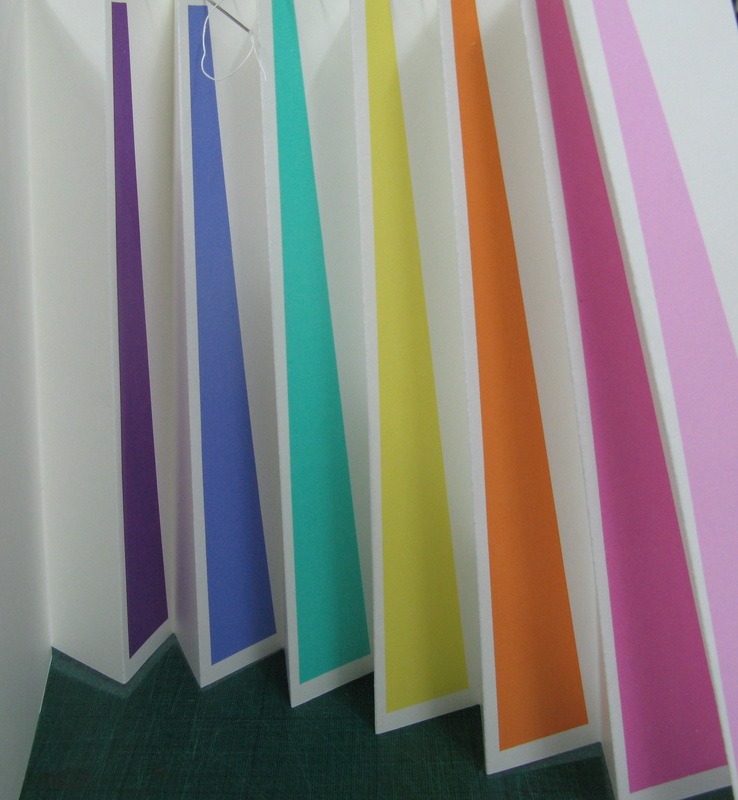
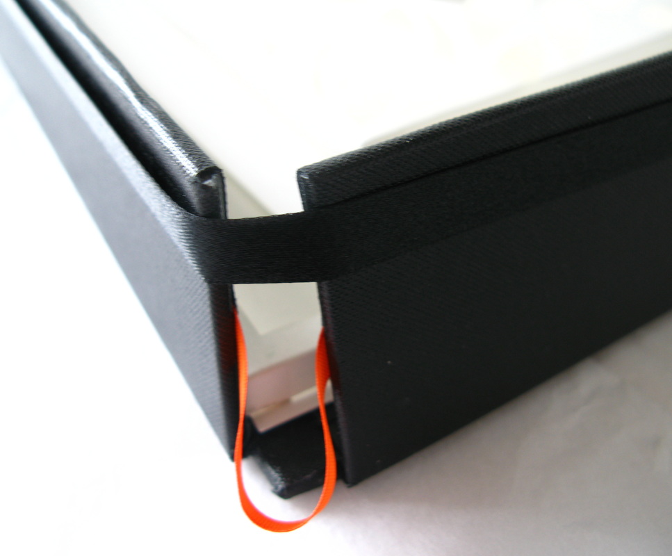
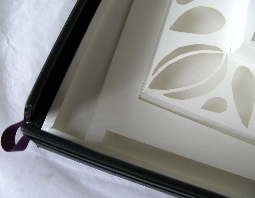
My first impressions of Peploe were of colour, rhythm and repeats - particularly in his still life paintings. The backdrops tended to be regular in design - horizontal bands, roughly trianglular in nature of pure colour. Fans - closed, jugs and flowers were constant motifs. We were told that the flowers had been identified by botanists and I looked up several, La Tosca, white - Antoine Rivoire, aprictot - Mme Caroline Testout and Mrs George Sawyer, both pink. Finally Marragon, Madonna lillies and Turks cap Lillies - used at the end of his life to depict the fragility of life and old-age. I decided to make a fan based on his life, a sort of biography of Peploe as artist. The book would take the shape of a fan, with seven peaks, one for each decade of his life. The inner fold of each section would have a printed wedge of colour, following his own use of colours closely. These roughly translated to the colours of the rainbow, pale pink, darker pink, apricot, yellow, green, violet and purple. Hence the pink of youth to the purple of old age. The fan would open out to pages based on the lace section of a fan with laser cut-outs echoing motifs in his paintings. The wedges of triangular colour of the backdrops, petal/brush stroke shapes and finally the lily itself. I wanted to have a collapsable box for it to sit in. Rather fragile, I did not want it handled too often. Time ran out and I was only able to make the base. I made another box in one-sided card in order to contain it all, packed with tissue paper to protect it. The base was held together by black ribbon which when taken off would allow the base to open and the book to be arranged on top. This was a very long project. From initial visit in November it took me to the 25th or so of February to complete. The wedges of colour were screen printed. The cut-outs resulted from a lot of new technology - photoshop, illustrator and ethos computer applications. I had the satisfaction of seeing everything from scratch - the inspiration, design I cannot quite believe how quickly the time has gone in. ECA has been full of challenges this semester. I have had to learn new skills, namely IT skills involving Photoshop, Illustrator and Ethos in order to work the laser cutter. There has been two major projects. The first the response to Peploe involving all the IT shennanigans. The second the Fragmentation project as it has now been termed. I have learned a lot in the process and feel positive about being able to pro
|
AuthorCarol E Duff Archives
May 2019
Categories
All
|


 RSS Feed
