|
Still finishing up the Menagerie project. Actually I am finished. The zigzag book is complete. It has been photographed for evidence - no doubt more photos will follow when in situ in the Sculpture Court for Friday coming and the Professional Practice aspect completed. But for now there is another bigger fish to fry. We have been asked to work in small groups to create Wiki pages on artists we have chosen to investigate as part of this project. I have spent the better part of today just getting my head round the technicalities of it. Surprisingly I have really enjoyed it! My chosen artist - Environmental artist Lynne Hull. Inspiring - devoting all that craft, creativity and genius to minimise the effect of humans on the habitat of wildlife around the globe. Maybe I can link the Wiki page when done but I have a feeling that as it is a temprary freeby it will not be viable.
0 Comments
We had a 'crit' on Friday last. The first of these for me as I had missed the first one through illness. It was amazing. Getting past the whole horrid nerves thing of standing up and let's face it - being judged - it was a revelation to me on a couple of pretty significant levels.
First and foremost was the amount of talent and creative energy around. Having folk stand up and discuss a common project from very different perspectives was enlightening. We had jewelers, fashion students, sculptors, glass students and illustrators to name a few. Not only was it an insight into how different people got into their project but also into how many tangents of thought there possible be coming from one topic. Secondly. How amazing that folk who do not have English as their first language can stand and deliver profound thoughts and difficult ideas. One student from China introduced her speil with an apology for her standard of English and then continued to throw in the word 'ambiguous'. I ask you! How many folk in the room could come up with any word let alone 'ambiguous' in Mandarin? 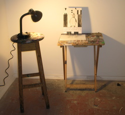 During the morning session with the tutors, I was advised by a Sculptor to use a newly constructed room in order to continue research with light. It was just that...a room. One strip light. Nothing in it. I had to locate the stool and table plus lamp in order to have the tools by which I could experiment with the presentation. The lamp was to cast shadows of the cage upon the page. No humour intended here really! Just an unforunate play of words. The annoyance of the angle-poise was that it was reluctant to strike any pose without a droop. A very likeable object in itself and in keeping with the theme - spotlight on the subject and so on but not practicable. 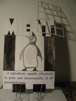 Playing with the 'Page' and the 'Cage' and a lamp in a small room. One thing also became very evident, the cages were too small! The detail on them, so labouriously consructed was lost and I had to consider how to suspend them. The height of the room was such that it would take a feat of engineering and many materials to enable any suspension to take place. Rather too daunting. 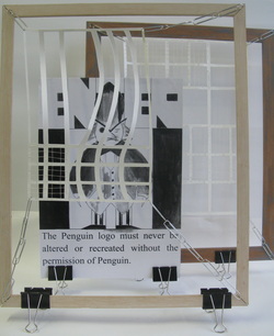 I thought one way out of suspension and a good way to add interest in terms of materials and design w as by installing the cages in frames. The cages were to be suspended using chains of silver paper clips. The frame was to stand on bull-dog clips. I liked the silver and black of the materials and thought they went well with the black and white of the print. However, the whole arrangment was unweildy and prone to falling. I was unhappy with the thought that the whole display could fall down and be damaged all too easily. I had to rethink. 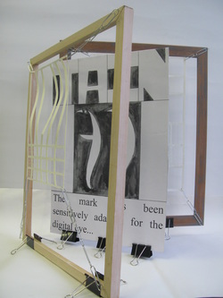 Through angling the various components I arrived at this book-type format. It was simpler but still unweildy. I spoke with a tutor from Product Design and this was most helpful. In the end I came back full-circle to the idea of the zig-zag book. Simple but effective to communicate my response to the visit at the zoo. All I had to do was make as pristine and polished as possible. Back to the one-sided card, a new metal ruler and a sharp craft knife. Development
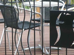 The photo that as far as I am concerned says it all! I am rather hoping that by writing down my own approach to this project I will arrive at a definitive response and make sense of what I am doing.
Sketching the animals was hard - they kept moving as a rule. When I tried to take photographs, I most often as not ended up with terrible blurred results that were almost immediately 'deleted'. I had much more success with recording the fabric of the zoo with the camera. I honed in on the different enclosures, the run of fencing, the gates and the imprint of animal tracks on the concrete pathways. These photos revealed a lot. Not only the rather discordant architecture arising from many years of enclosures and uses but also the different approaches employed and materials used. One particular photo sums up the project for me, (that is the photo up at the top) or at least represents part of what I took away with me at the end of the day from the zoo. This snapshot is of cafe area - a decking on which chairs and tables sit, almost camouflaged in themselves being of similar lines and material to the iron fence that encloses it. Taken early in the day, there is no human present. Nor are there any signs of any animals, or more specifically the penguins easily visible in their watery habitat down below. Embedded in the vertical slants of the fence is a piece of metal sculpture. The penguin consigned to a basic 'logo'. The black and white of the photo gives all the components of the study a cohesion. So here we have it. The zoo of old was a place where people could come and gawp at wildlife they would not otherwise have ever seen. Entertainment of the likes of the circus - the bearded lady and the goaded bear. Modern day zoos are credible in terms of their conservation work. Strapped for cash they nonetheless have to provide entertainment along with education. Without entertainment they would not get the footfall with the spending power by which the zoo can fund its projects. Hence all the coffee areas and viewing arenas. The visitors who come to the zoo are accustomed to reality being packaging, boxing and 'cutesy'. As food is presented in a supermarket, clean, uniform and as far removed from the messy processes of manufacture as possible, the zoo follows suit with their presentation of the animals - up to a point. The animals although present are packaged for information in terms of images in keeping with children's books/animation. The cafe is full of plastic lions and chairs in the shape of giraffes. The penguin is a logo round a cafe and a fluffy toy for sale in the shop. Away from the zoo research followed. What else - I mused governs the way we look at animals in terms of entertainment? My focus shifted to the large budget and very successful film versions of Marvel Comic Characters etc. Batman, Catwoman, Spiderman, Wolfman and of course the arch-villain The Penguin. Most of these characters had in common worthy and heroic physical traits taken right out of the Animal Kingdom. The Penguin on the other-hand less so - all he had in common with the 'real' penguin was his appearance which in a human was rather comical and not a little scary. Further research brought me to the Penguin Book Publishing House. Seventy-five years old this year. Established in 1935 in response to the lack of cheap and available paperback fiction books. You either had to be a member of the library or rich in order to obtain books. The original Penguin paperback was designed to fit in the pocket and were to be made available at Railway stations etc in machines. Influenced by a German Publisher Albatross, the name Penguin was mooted and a designer dispatched to the London Zoo. The Penguin Book Logo was born to advertise books intended to entertain the public. I now had three versions of penguin to work on, the Penguin Image at the Zoo, The Penguin comic character and the Penguin Book Logo. All important in terms of the themes of re-branding and reproduction of images. The commercial re-packaging of a bird I only have ever seen round a smelly watery enclosure at Edinburgh Zoo. I borrowed from the standard Penguin Book front page format and invented three new covers incorporating my three Penguin characters. I also focused on all the designs of gates/cages and fences around the zoo to create cut-outs. Meshed together in a zig-zag book I had my maquette. I am currently experimenting with light sources in order to explore the idea of light shining through the cut-outs to cast shadows of bars on the 'covers' to imply incarceration. The 'covers' are to sit on prints of photos I took of the bird foot imprint. The reverse of the covers are to be an exercise of reproduction again - this time of photos taken of actual enclosures with down-loaded original images of my three Penguin characters superimposed on the top. This leads me to a fortuitous find on the Internet. With the digital age, there are obviously all sorts of imposed restrictions on the reproduction of the Penguin Book Logo. This has given me wonderful wording for the foot of my 'covers' which will hopefully add cohesion to the three renditions of the penguin and will give literal weight to this dimension of the project. The covers are to sit with the aid of bull-dog clips. Black and silver they lend to the overall colour scheme and can be construed - almost - as penguin feet. As regards suspending the cut-outs in front of the 'covers' - having spent time in a small room gazing at the shadows created by means of a reading light I have decided on a pragmatic approach to get round otherwise difficult constructs. This week I will be experimenting with wooden picture frames, wire and chains of silver paper clips! Officially, I am a First Year at ECA on the Painting Programme. There seems to be students already specialised in Product Design, Landcape Architecture, Illustration, Animation, Sculpture etc... the list could go on. The divide is fluid however, with Generalists still to decide and those who thought they have - like me - able to undecide/decide and redecide up to the last minute before successfully graduating in ... something.
The first project - one covering five weeks is entitled Menagerie. To inspire, instruct and inform - we were given a day's research at Edinburgh Zoo. Not having been there since the days I exposed myself - not only to the elements on the blasted Corstorphine Hill- but also to the possibility of serious injury whilst pushing a double buggy containing two small children, I wondered what I would find a good fifteen or so years later. I rather expected negative responses and they were forthcoming. Sadness at the enclosing of frustrated and lonely animals and cynicism directed at the marketing of fluffy animals in the shop we had to walk through in order to gain our escape. Bizarrely though there was a lot of fodder on which to base a project on. Those negative responses I dreaded were resoundingly shared by others and this lead to very animated and productive discussions. One of the themes almost universally picked up on was that of the enclosures. Were they there to keep the animals in or us out? Perhaps not that profound but a good starting point quiet contemplation. Some people noted the electric fencing - not very successfully camouflaged on the outside of the cages and the disproportionately large number of notices carrying warning signs about the dangerous beasts that the cages contained. Also, rather worryingly, we were left wondering at who was actually doing most of the observing - them or us? I am struck by the number of Overseas students there are. I am in awe of them studying in a country where English is not their first language and impressed by their drive and commitment. It makes for a very exciting environment to be surrounded by folk from such far-off places as Greece, Poland, Finland, China and France to name but a few. I went to assist Tina - the Greek as opposed to Tina the Fin - with her laptop. Armed with good intentions and rather pleased I had figured out how to engineer uploads of photos I was bemused at all the file names being in Greek - ah well we got there in the end but really why I was surprised at the laptop in question 'speaking' Greek like her owner I cannot fathom.
I am not the only mature student embarking on this voyage. I have the company of Maggie who I met at Leith last year on the Painting Course and who like me got together the UCAS application plus portfolio and applied with more hope than expectation. There are also quite a few 'kent' faces from Leith Foundation Course from the last two years. In the maturer ranks there is also Tina the Greek, (Tina the Fin is markedly younger) and Sally. We bonded in a knowing way early on. In general though I am finding it hard to work out relative ages. It is dangerous territory to start allocating ages to the younger students and really age is no marker of maturity. Females outnumber males but I suppose I was expecting that. Befuddlement sums up the general response to a newly revised programme of study in an Art School which is undergoing merger talks with Edinburgh University. Whatever the cause, confusion reigns as regards course content, timetabling and location. Being rather maturer than the average First Year, the younger ones attribute me with more knowledge than I possess. Fielding questions concerning where they should be at any one time seems to be par for the course. Being rather conditioned as teacher/mother to deal with the issues of others I seek to rise to the occasion but it is rather liberating to accept this as not being possible. I am after all one of them - also confused and befuddled. I am assuming that ECA will attempt to retain its own name and sense of identity throughout the merger talks and eventual event if it comes to pass. Obvious perks lie in the fact that ECA students will have the choice of various modules in such things as anatomy, sociology etc to add new dimensions to their study of life drawing and painting. Apparently it is all to do with ensuring funding in years to come and where ECA is daring to tread this year, other art institutions like Glasgow will follow in years to come. |
AuthorCarol E Duff Archives
May 2019
Categories
All
|
 RSS Feed
